
CodingIndo
Created By Devis Wisley

Created By Devis Wisley
Saturday, August 31, 2024
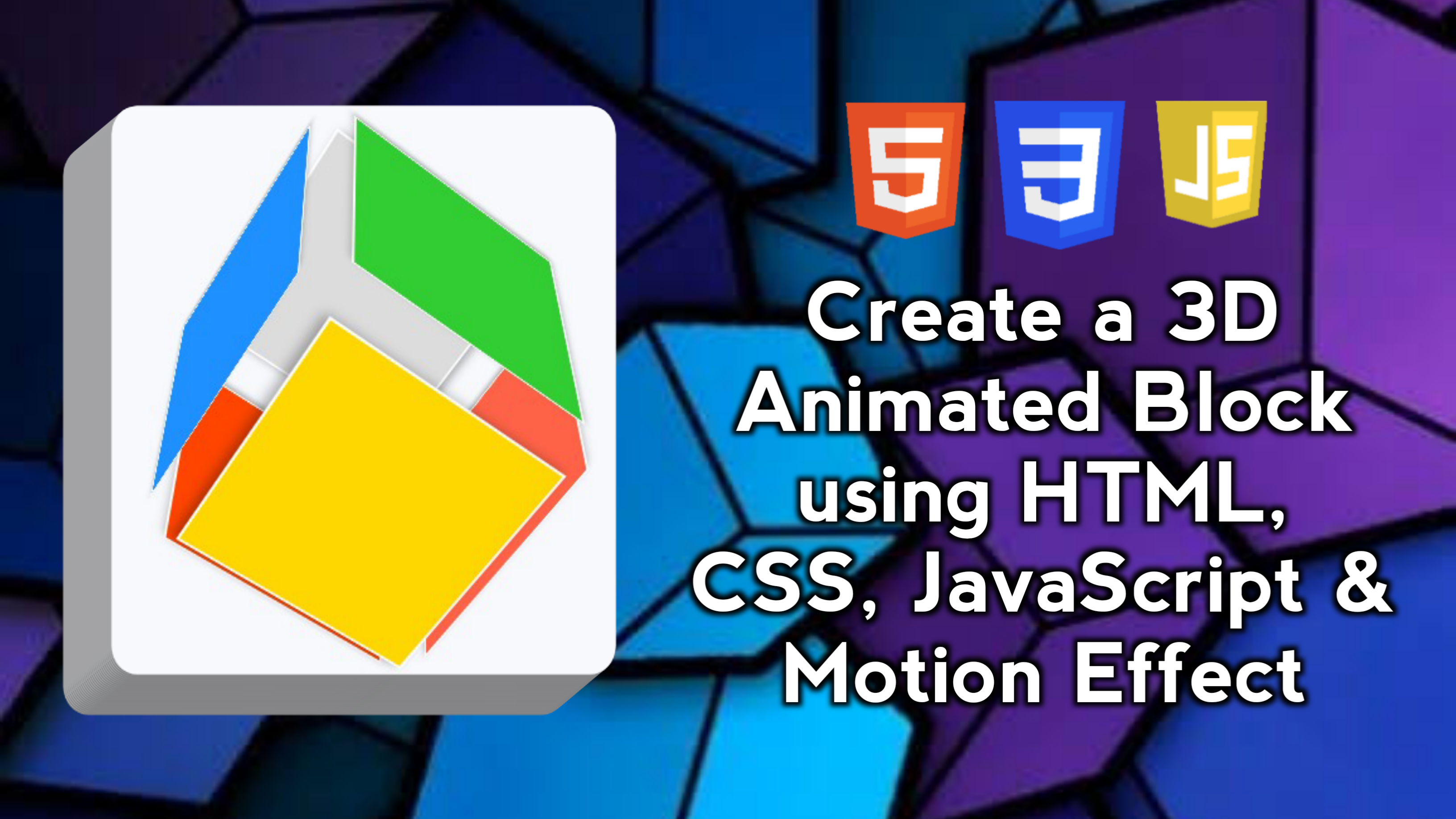
Creating a 3D Animated Blocks is an interesting way to add dynamic and interactive visual effects to a website. This project involves HTML for the element structure, CSS for styling and animation effects, and JavaScript for mouse-based interactivity.
In this blog post, I will walk you through creating an interactive 3D animated block using HTML, CSS, and JavaScript. We will replicate dynamic 3D visual effects, including auto-rotation, mouseover interaction, and responsive design. This block will have smooth animations and can be used to add interactive elements to your website. We will also add a motion effect feature that allows users to move the 3D cube with cursor control, creating a more lively and engaging experience.
As you work on this project, you’ll learn how to structure and style websites effectively to ensure they look great on all devices.
With these features, your 3D animation blocks will have complete functionality and an attractive design, making them not only useful but also fun to use.
By building this 3D animated block project using HTML, CSS, and JavaScript, you can gain the following skills:
This project will provide a solid foundation in responsive web design and front-end development, paving the way for more complex web projects in the future. Good luck and may the skills you gain be useful in developing future projects!
Here are the steps to create a 3D Animated Block that moves with animation effects using HTML, CSS, and JavaScript.
Start by creating a basic HTML structure. Here we will create a container div to manage the scene (block view) and cube elements (3D blocks) with some faces.
<!DOCTYPE html>
<!-- Coding By CodingIndo - https://codingindo.vercel.app/ -->
<html lang="en">
<head>
    <!-- Meta tag for character encoding -->
    <meta charset="UTF-8">
    <!-- Meta tag to make the viewport responsive on mobile devices -->
    <meta name="viewport" content="width=device-width, initial-scale=1.0">
    <!-- Page title -->
    <title>3D Animated Block</title>
    <!-- Link to CSS file for styling -->
    <link rel="stylesheet" href="style.css">
</head>
<body>
    <!-- Container for 3D scenes -->
    <div class="scene">
    <!-- Container for 3D cube -->
        <div class="cube">
            <!-- Front side of the cube -->
            <div class="face front"></div>
            <!-- Back side of the cube -->
            <div class="face back"></div>
            <!-- Left side of the cube -->
            <div class="face left"></div>
            <!-- Right side of the cube -->
            <div class="face right"></div>
            <!-- Top side of the cube -->
            <div class="face top"></div>
            <!-- Bottom side of the cube -->
            <div class="face bottom"></div>
        </div>
    </div>
    <!-- Link to JavaScript file for functionality -->
    <script src="script.js"></script>
</body>
</html>
| Number | Line of Code | Explanation |
|---|
Next, add a CSS file to style and animate the 3D effects. Set the size of the cube and its faces, and add animation for rotation.
/* Each element is rearranged to ensure no margins, padding, or border-boxes affect the layout */
* {
    margin: 0;
    padding: 0;
    box-sizing: border-box;
}

/* The body of the page is set to display the content centered and has a height of 100% of the viewport */
body {
    height: 100vh;
    display: flex;
    justify-content: center;
    align-items: center;
    background: #f7f9fc;
    font-family: Arial, sans-serif;
}

/* The scene (view block) is set to 250px x 250px and has a 3D perspective */
.scene {
    width: 250px;
    height: 250px;
    perspective: 1000px;
}

/* Cube is set to 100% of the scene and has a 3D rotation effect */
.cube {
    width: 100%;
    height: 100%;
    position: relative;
    transform-style: preserve-3d;
    transform: rotateX(30deg) rotateY(30deg);
    animation: rotateCube 15s infinite linear;
}

/* Each side of the cube is set with a different background color */
.face {
    position: absolute;
    width: 250px;
    height: 250px;
    background: rgba(0, 150, 255, 0.8);
    border: 2px solid #fff;
    box-shadow: 0 4px 8px rgba(0, 0, 0, 0.3);
    display: flex;
    justify-content: center;
    align-items: center;
    font-size: 1.2rem;
    color: #fff;
    font-weight: bold;
}

/* Each side of the cube is set with a different 3D transformation */
.front  { transform: translateZ(125px); background: #1e90ff; }
.back   { transform: rotateY(180deg) translateZ(125px); background: #ff6347; }
.left   { transform: rotateY(-90deg) translateZ(125px); background: #32cd32; }
.right  { transform: rotateY(90deg) translateZ(125px); background: #ff4500; }
.top    { transform: rotateX(90deg) translateZ(125px); background: #ffd700; }
.bottom { transform: rotateX(-90deg) translateZ(125px); background: #dcdcdc; }

/* Continuously rotating cube animation */
@keyframes rotateCube {
    0% { transform: rotateX(0deg) rotateY(0deg); }
    100% { transform: rotateX(360deg) rotateY(360deg); }
}

/* Responsiveness of cube and its sides for screens with width less than 600px */
@media (max-width: 600px) {
    .scene {
        width: 200px;
        height: 200px;
    }
    .face {
        width: 200px;
        height: 200px;
    }
}
| Number | Line of Code | Explanation |
|---|
Add JavaScript to provide interactive effects when the user moves the mouse. The mouse movement will rotate the cube based on the mouse position.
// Add event listener to detect mouse movement on elements with class 'scene'
document.querySelector('.scene').addEventListener('mousemove', function(e) {
    // Calculate the x and y position relative to the browser window
    const x = e.clientX / window.innerWidth - 0.5;
    const y = e.clientY / window.innerHeight - 0.5;
    // Sets the 3D transform for elements with class 'cube' based on mouse position.
    document.querySelector('.cube').style.transform = `rotateX(${y * 45}deg) rotateY(${x * 45}deg)`;
});
| Number | Line of Code | Explanation |
|---|
The 3D blocks will rotate automatically, and when the mouse is moved within the scene, the cube will follow the mouse movement, adding an interactive effect.
Those are the steps to create an interactive 3D Animated Block using HTML, CSS, and JavaScript.
By paying attention to these additional points, you can improve the quality and usability of your 3D animation blocks, ensuring that they are not only functionally effective but also user-friendly and accessible.
Creating a 3D Animated Block using HTML, CSS, and JavaScript is a creative way to add interactive and dynamic elements to a website. Through this project, we learn important concepts such as:
Thursday, October 17, 2024
Sunday, September 01, 2024

Saturday, August 31, 2024

Sunday, September 08, 2024
LEAVE A REPLY